Greenlancer
Role: Lead UX Designer
Tools: Sketch
Methods: Sketching, participatory design, & high fidelity prototypes
Greenlancer
Role: Lead UX Designer
Tools: Sketch
Methods: Sketching, participatory design, & high fidelity prototypes
Work Overview
GreenLancer is a startup that is focused on providing a platform that leverages standardization, automated workflow, and a large network of solar professionals. As Greenlancers sole UX employee, I was responsible for creating and maintaining all aspects of GreenLancer's user experience. My duties included developing the new UI, creating and maintaining the digital style guide, identifying what aspect of the UI needs to be worked on next, setting up participatory design sessions with stakeholders, identifying and monitoring KPI's, and developing interactive prototypes.
My Design Process
My design process at GreenLancer slightly differed from my design process at GE. When I started working on a new feature, I sketched out wireframes in order to come up with a basic idea of what I think the feature should look like. Along with the sketches, I came up with a list of questions that I had regarding potential interactions. After this, I held a half hour or hour long session participatory design session with our CTO. By holding a participatory design session so early in the process, we were both able to see how the other person envisioned the development of the feature, and were then able to come together around a unified design. This solved a problem that we had early on where I would create a design for a feature, and he had a different vision as to how that feature would be designed.
After this meeting, I went back and redid my sketches based around the outcome of the meeting. Then I began to transfer my designs into Sketch where I turned them into higher fidelity mockups. After this, I held another meeting with the CTO and any other interested stakeholders in order to get feedback. I made changes if necessary, and then I created a page in our internal Wiki for this feature. This was a great way to share with the rest of the company what I was working on, and when writing out the description for the feature, I was able to catch any interactions that I either missed, or implemented incorrectly. I also made interactive prototypes if necessary.
Features & Benefits
Upon arriving at GreenLancer, I was tasked with redesigning the entire UI. This was a major undertaking, but I was excited to do it as I knew that I could drastically improve the existing UI. I conducted a heuristic analysis during my first few days at the job, and the biggest issue with the existing UI was that it was very hard to tell where you were. While there was a breadcrumb, it was located at the bottom of the application, which is a very unintuitive place to put it. The second issue was the fact that many of the pages that users had to navigate out were cumbersome and would display information that was wholly unnecessary to the task at hand. One example of this is how a page that consisted of around 10 text fields stretched about 2-3 printed pages down due to the fact that the page insisted on showing multiple read only fields that consisted of installation information that was not pertinent to the form that the user had to fill out.
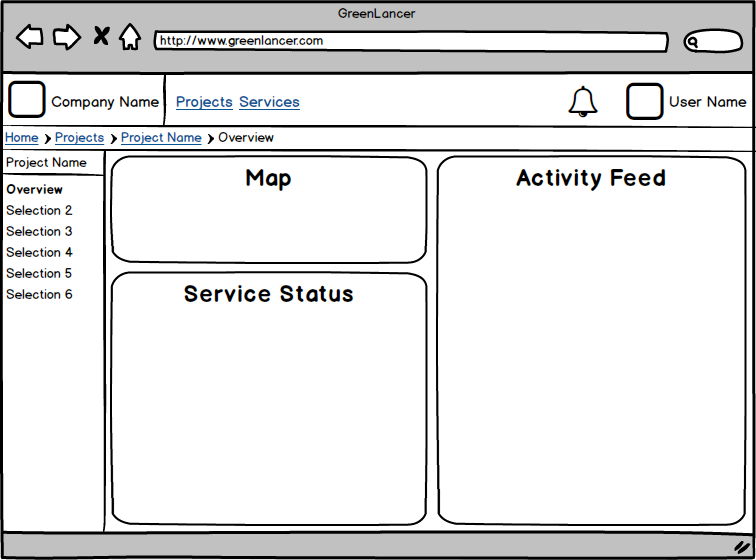
The first feature I worked on after the heuristic analysis was the overall look of the project page. Users spend most of their time on our site working on individual projects, so increasing the usability of the project page was my number one priority. The first (and most major) change I made was to make the project page look more like a dashboard. The benefits of this are twofold. The first benefit is that by having a static list of high level options in the sidebar, the amount of time it takes for users to get to their desired page is drastically decreased. The second benefit is that it simplifies the schema that users have to learn, which will reduce their cognitive load. The old UI divided items such as attachments and discussion tabs up by services, even though the services were all in one project. This caused customers and internal users alike issues when it came to remembering what service a specific file or discussion was located in. The third benefit is that I was able to move or remove unnecessary and rarely used elements, such as the archive and edit buttons as well as a block of text that was dedicated to four project parameters that were not needed. In their place I was able to add in features that had been requested by users, such as a service status and an activity feed. I also added a map that would link to Google Maps and display a satellite image of the address where the project was taking place.
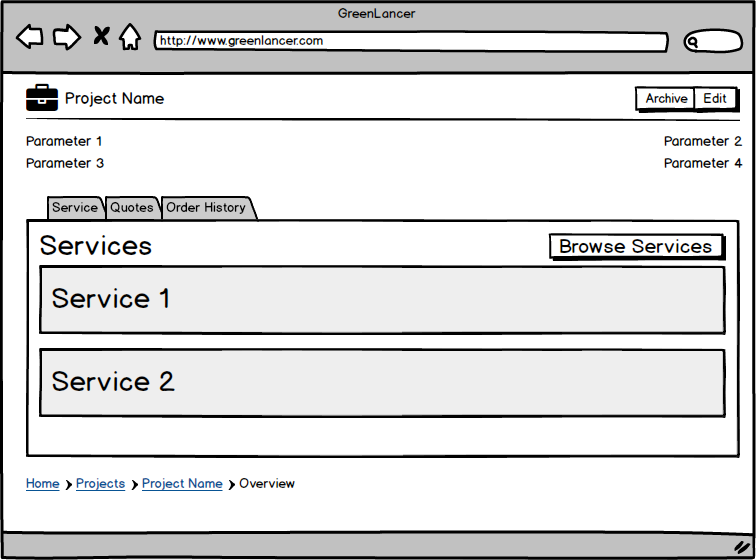
Wireframe mockup of the old project overview.
Wireframe mockup of the new project overview.
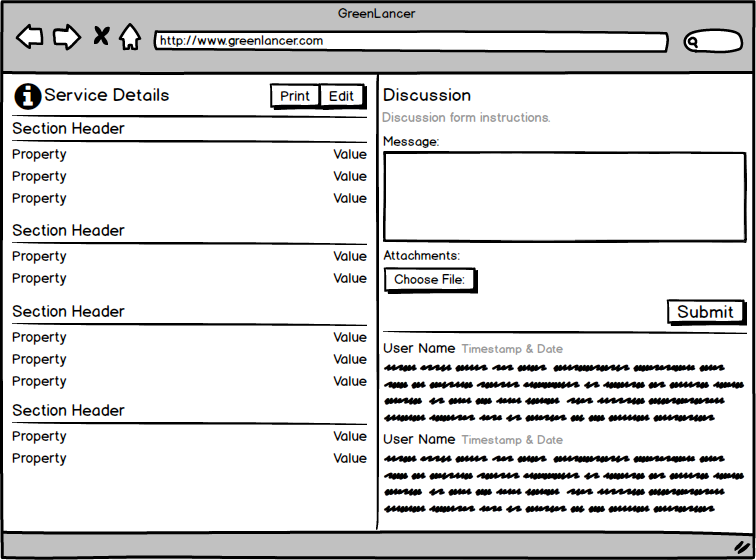
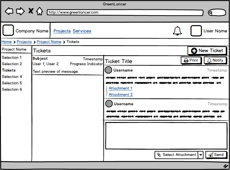
The second feature I worked on was changing how our users communicated with us. Our users primarily communicate with us through the discussion tab that is located within an individual service. The primary issue is that one project can have multiple services, and if we have to fix a mistake, a change order service needs to be created. This leads to mistakes being made on our end, and unhappy customers inquiring as to why we didn't follow their instructions. My solution was to create a Tickets tab that would allow internal and external users to quickly and efficiently send messages back and forth while minimizing the chance that our internal team will make mistakes.
The benefits of the Tickets tab go beyond reducing user mistakes. Since it serves as a repository for all customer communication, it's trivial to switch between messages. Instead of having to go into a service, scroll down to the discussion tab, then go back out to another service, users can quickly view and respond to messages. Another benefit of creating the Ticket tab was that I had the opportunity to work with our production team in order to identify potential features that they wanted to see in the new UI. One such feature was the ability to send messages that were only visible to those with admin rights, while another feature was to introduce a "resolve issue" button that would close out the thread and let all participants know that the issue had been taken care of.
Wireframe mockup of the old Tickets overview.
Wireframe mockup of the new Tickets overview.
Lessons Learned
While Greenlancer was a great learning experience, there are some changes I would make if I was given the chance to start over. The first change I would make is to develop the screens with a mobile first implementation in mind. While the dashboard aspect lends itself well to a mobile screen, there are still some constraints imposed by the smaller mobile screen that I wish had been resolved earlier. Some constraints included choosing what elements to hide and show and how to deal with wide tables. A second change I would make is to do more initial sketching. While the participatory design sessions that I hold always involve sketching, I noticed that I would then refine those designs in Sketch instead of refining them on other whiteboards and then putting them into Sketch.