Overview
I began working at GE Bently Nevada as a user experience designer on Bently Nevada's condition monitoring software package, System 1 Evolution. My duties as an user experience designer include writing requirements, developing interfaces for new aspects of System 1, creating personas, revising the appearance of existing personas, creating and executing research plans when necessary. I have also had the opportunity to do UX work outside of System 1 by working with the Brilliant Factory initiative to research user needs, and then develop a UI that would address those needs.
Design Process
After I am assigned a feature, the first step that I take is to identify what I can develop based upon my existing UX knowledge. First, I sketch ideas out on a whiteboard since it's easier to create multiple sketches and change direction quicker than
if I had started directly on the computer. After I create the sketches, I talk with our subject matter experts (SME's) regarding what they would want to see in the final product, and how it would benefit the user. I usually create
sketches before talking to the SME's so I can create a basic UI without being influenced by what they want included or excluded. After getting their feedback and revising my sketches, I go ahead and make rough wireframes in Axure.
At this point, I also start outlining requirements. At this stage of the process, I keep the requirements at a very high level so that there is room to change course if necessary. After creating the wireframes and beginning
the requirements, I run the wireframes by the SME's (and occasionally developers) in order to get feedback. Once I receive feedback I adjust my designs and requirements as needed. I also ask the other UX designers in my group to
look over small sections of my design at a time in order to get their feedback about what they feel could be improved. As the prototype becomes more fleshed out, I attempt to incorporate interactions within Axure so it seems like
what I design is a real program and not just static screens. This cycle of design and feedback repeats until a few days before the deadline.
Working On A Feature
After I am assigned a feature, the first step that I take is to identify what I can develop based upon my existing UX knowledge. First, I sketch ideas out on a whiteboard since it's easier to create multiple sketches and change direction quicker than
if I had started directly on the computer. After I create the sketches, I talk with our subject matter experts (SME's) regarding what they would want to see in the final product, and how it would benefit the user. I usually create
sketches before talking to the SME's so I can create a basic UI without being influenced by what they want included or excluded. After getting their feedback and revising my sketches, I go ahead and make rough wireframes in Axure.
At this point, I also start outlining requirements. At this stage of the process, I keep the requirements at a very high level so that there is room to change course if necessary. After creating the wireframes and beginning
the requirements, I run the wireframes by the SME's (and occasionally developers) in order to get feedback. Once I receive feedback I adjust my designs and requirements as needed. I also ask the other UX designers in my group to
look over small sections of my design at a time in order to get their feedback about what they feel could be improved. As the prototype becomes more fleshed out, I attempt to incorporate interactions within Axure so it seems like
what I design is a real program and not just static screens. This cycle of design and feedback repeats until a few days before the deadline.
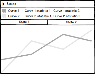
Initial prototype of a chart with state bars.
Initial prototype of a chart with state bars.
At this point, I tried to combine line styles and colors. I knew that I wanted to signify the beginning and ending of a state, as well as having indicators throughout the state that would let the user know that the machine was still in a specific state. To accomplish this, I put X's at the beginning and end of a state, as well as X's at regular intervals in between the X's marking the beginning and end of the state. In order to differentiate between states, I made sure that each state had an X that was a different color. If a state would overlap with another state, the X's would still be able to stand out from each other.
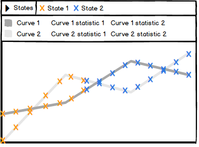
Prototype of a chart with X's at regular intervals.
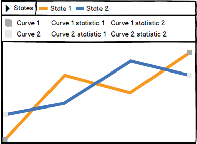
Final design with curve colored squares on the end of each line.
Prototype of a chart with X's at regular intervals.
Final design with curve colored squares on the end of each line.
However, there were some concerns that there would be too many X's on the plot which would result in a lot of visual noise. To solve this issue, it was decided that only the X's indicating the beginning and end of states should stay on the plot. Since this could result in users not knowing what part of curve was in a state, I reluctantly agreed to change the color of the line if the curve was in a specific state. A coworker brought up the point that it may be hard to see the X's if they are only on the ends of the curve, so the X's were changed to squares that had the color of the curve before state mode was activated.