Redesigning Account Manager
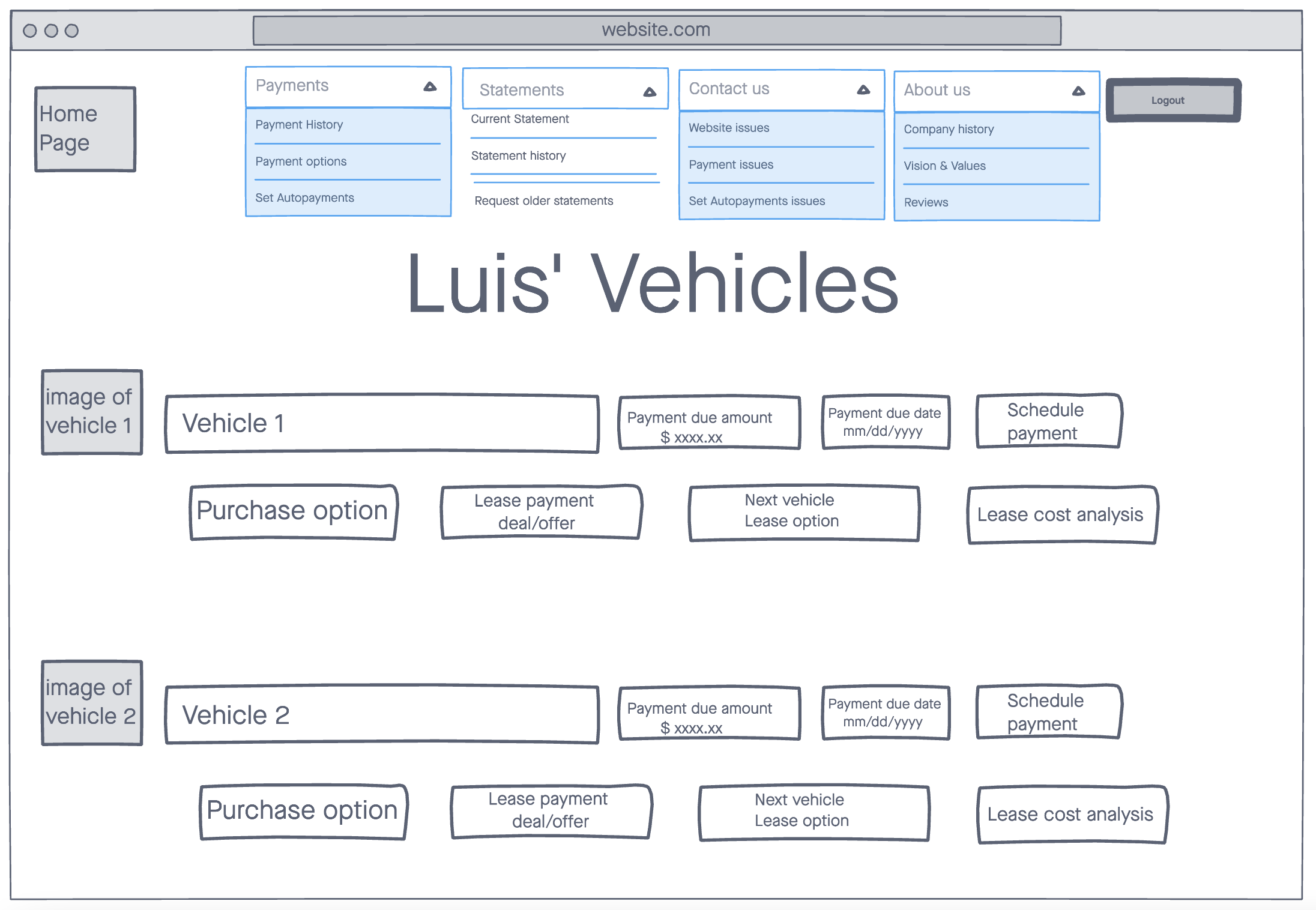
While working on Account Manager, I noticed that there were some structural issues that could not be easily fixed outside of a major redesign, such as a tab bar area that was too small to contain all our main pages on mobile, and a sidebar that was overly optimized for mobile, which meant that we were forcing users on the desktop to manage their preferences in a sidebar that was fixed to a width of 375px, as this was the width of an average iPhone at the time. Around the same time, business had made comments about potentially redesigning Account Manager, so I figured the time was right to start doing some initial work on how Account Manager could be redesigned.
The first step that I took was to create a survey, and send it out to a group of Ford employees in the United States. For this, I utilized an in-house group that had a collection of email addresses, as using their pre-existing address book would be a lot easier than trying to connect with users myself. Some of the questions that were asked were whether they leased/financed, how they felt about their current lease/finance management site, and whether they were willing to be contacted about participating in future design workshops.
 Result of a participatory design session showing a desktop version of a leasing website.
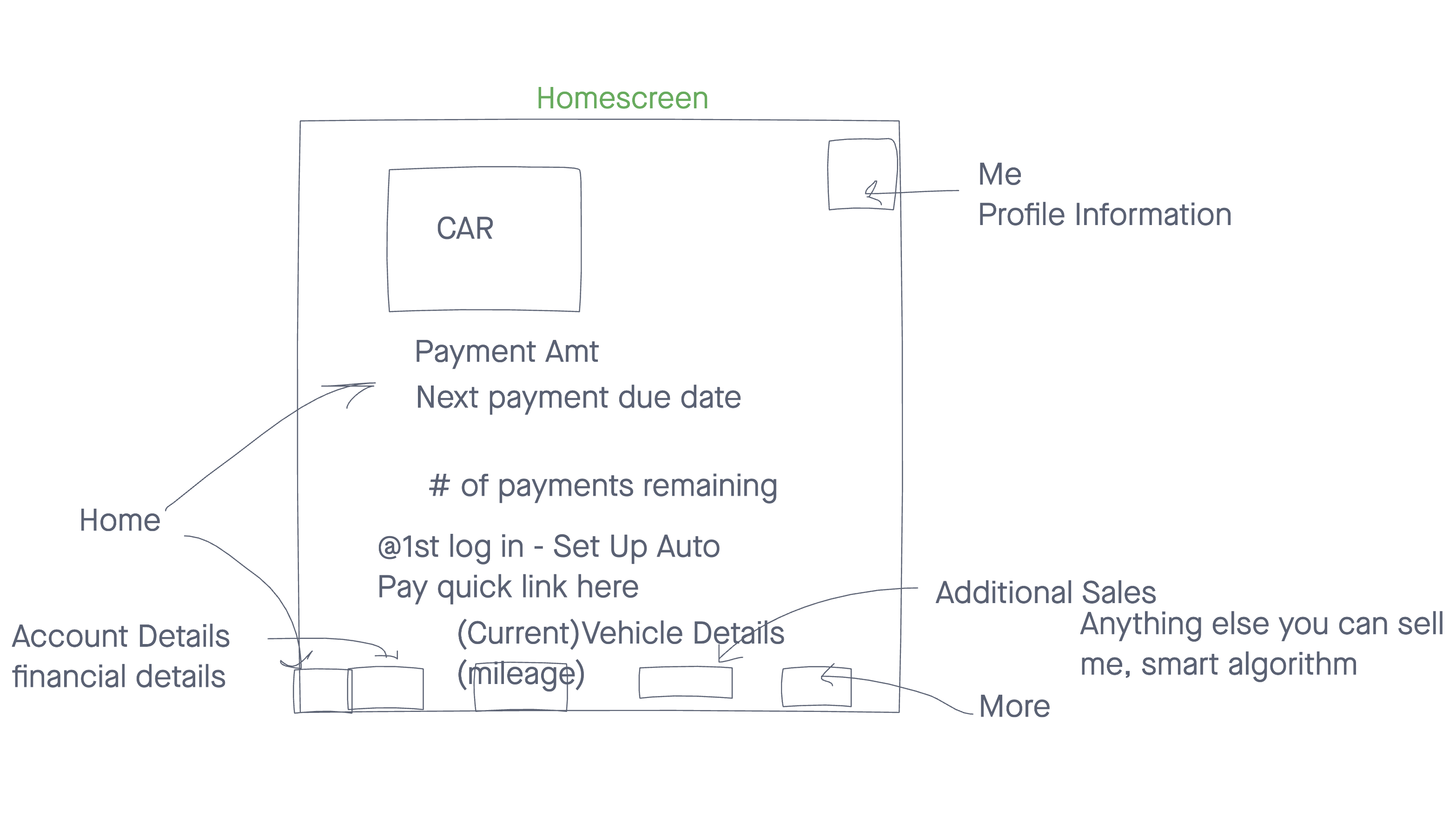 Result of a participatory design session showing a mobile version of a leasing website.
While we were collecting survey responses, I developed a structure for the design workshop. The workshop ended up being split into two different parts. The first part was a collection of questions designed to gather information about their lease/finance term, as well as what they would expect to see when logging into their vehicle financing website, and any positive/negative pain points of their current vehicle financing website. The second part was an activity using Invision Freehand where we asked them to build their ideal lease/finance website, and asked them to complete certain tasks such as building out a homepage and making a payment. Using Freehand for this task was a bit of a learning curve, as many of our participants had never used Freehand before. While I hoped that this could be done in a dedicated UX testing lab, the pandemic caused those plans to be disrupted, so I had to use the tools that were available.
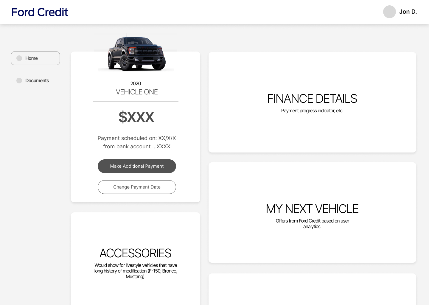
Afterwards, I created an affinity map in order to identify common themes across all interviews. I then started building out a wireframe that could serve as a basis for a more high fidelity prototype down the line.
 Wireframe showing off the initial layout for a revised Account Manager.